Banco de Crédito del Perú
Design of servicing and sale flows for ViaBCP, the bank's public website.
Introduction
My role within the organization was UI Designer Senior, and as such I carried out a variety of tasks ranging from the analysis of existing flows and interface designs, to the creation of new ways of organizing files and components.
Given the fact that I cannot show my processes, results in data or private designs within the bank, I will summarize the most important tasks I performed along with some examples.
Analysis and IA: MBOX
At the bank I carried out, both alone and with my UX partner, analysis prior to accepting a business requirement. This was to ensure that the objectives presented to us were achievable as well as being the correct decision.
The following image shows an example of analysis for the inclusion of a personalized component (MBOX) on multiple pages in ViaBCP. The challenge was finding the appropriate position for its placement, preventing it from obstructing the reading of the product, but without pushing it to the end of each page.
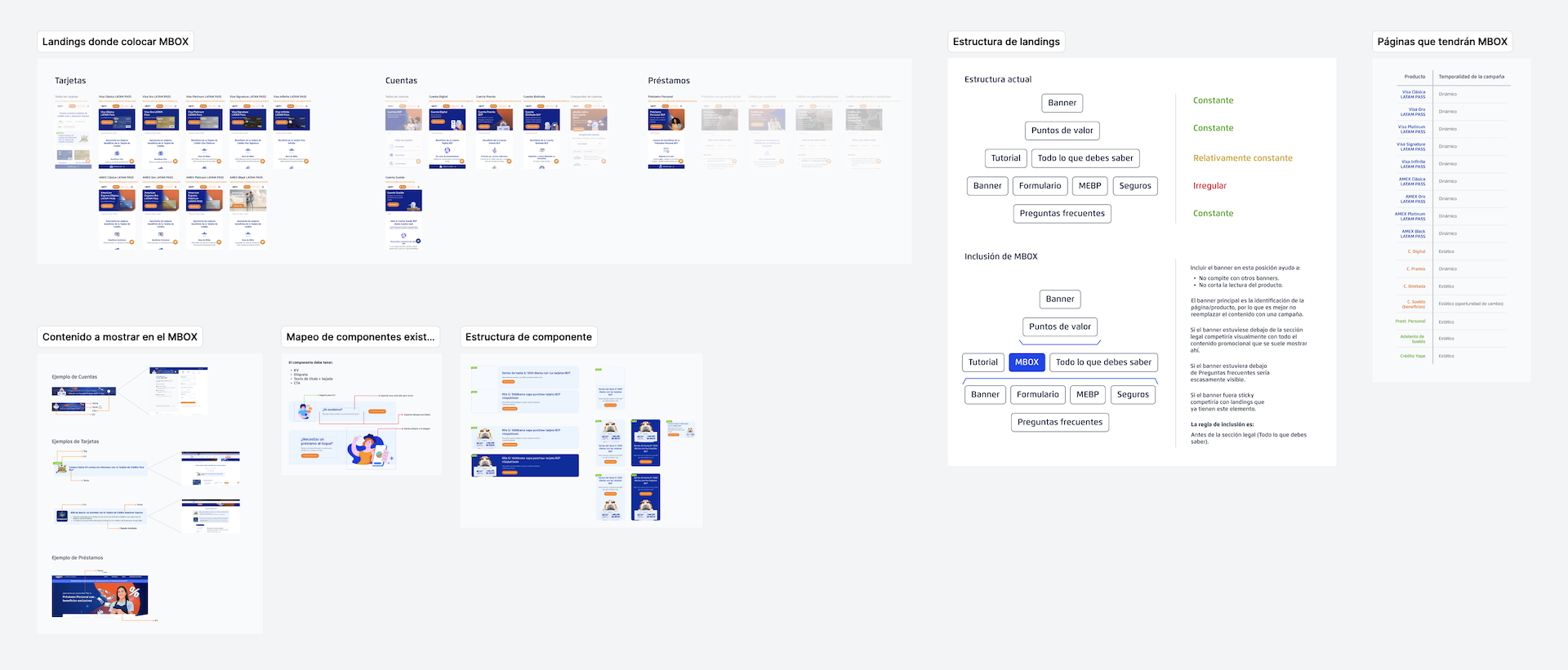
This analysis was carried out as a prior step to the design of the MBOX, since we considered it necessary to, first, understand the place where it would be placed before moving on to a more visual aspect.
Flow design: ViaBCP’s menu
The wireframing work falls under my UX partner’s responsibilities, although that does not imply that I have not been involved in such process. In fact, working together has been one of the strengths of my team. But, due to authorship issues, I prefer to not show my partner’s work in this portfolio.
However, it is evident that when the wireframing was completed, and it was tested and validated with business, I was in charge of its transfer to high fidelity. The structure of the flows in the design program (Figma or Sketch) varied according to the requirements of my COE (whether the handoff was done in Zeplin or directly in Figma), so it was necessary to make some adjustments depending on the initiative worked on.
An example of this is the navigation flow of the new ViaBCP’s menu. Upon concluding the usability tests and closing the IA in wireframes, the new menu was designed in high fidelity. To ensure its correct functioning in each case, the variations of the menus for Personas, PyMES and Empresas were prototyped, as well as its Quechua variants.

Capture of menu flows on desktop. This form of organization in Figma is designed to be read correctly when imported into Zeplin.

Sample of the mobile flow (in prototype) of the menu. This for the Personas menu.
The final result of the menu can be seen currently in production at ViaBCP. The illustrations for the menu banners on the Personas, PyMES and Empresas pages were illustrated by me.
Final result of the menu redesign.

Illustrations that I adapted and created for the menu banners.
Iconography design: Mi Espacio BCP
Another of my functions at the bank was to create iconography and illustrations. Although this is a much more visual endeavor (for which my team had another role), my background as a graphic designer and illustrator allowed me to give greater personality and interactivity to the interfaces I designed.
An example of this are the images, illustrations and icons that I made for Mi Espacio BCP. This was a great project that we started during my time at the bank and that continues to evolve until now, however, as it has a delicate backend logic, it is not possible for me to show further details of the initiative.
Even so, I can give as an example the iconography that I made for the onboarding section.
These icons were designed respecting the bank's illustration guidelines.
Full landing design: ViaBCP's home
The types of projects I took at ViaBCP can be divided into two general groups. Through global components (that is, they are used on several pages of the website) or through complete redesigns of important pages.
An example of the latter is the 2022 redesign of ViaBCP's home. This was done with the intention of increasing scrolling as well as giving greater visibility to the bank's billing campaigns.
The vector animations as well as the parallax effects were done by me and properly documented for handoff to development.
Vector animation: Marketplace
In addition to the prototypes and final designs, another thing that has been not only attractive but has managed to increase the number of interactions are animations. I can divide my animation and interaction work into two groups.
Animation in JS: These types of animations were prototyped using Webflow or coded by hand to generate a smaller gap between the final design and the developers. These include parallax effects, card interactions or events triggered by the scroll position.
Lottie Files: It is the animation of SVGs using After Effects.
An example of both cases can be seen below. I made this interactive design from scratch, starting with the illustrations, then animating the Lotties, and finally the HTML with JS to trigger the entry and exit animation.
Abrir una Cuenta
Obtener Tarjeta de Crédito
Solicitar un Préstamo
Adelantar mi sueldo
SOAT virtual desde S/39.90
Asegurar mis viajes
You can interact with this design.
To see the interactive design you must be on a desktop device (1300 px min.).
File Management and Design System: ViaBCP
My team was among the first to use a design tool different from the rest of the bank, a tool that was later adopted by the organization. This meant creating a new system for the organization of files, pages, nomenclatures, covers, flow templates and others that would serve as a template for the subsequent migration.
Another important task resulting from the use of a different tool was the need to create an exclusive design system for our needs, which were paired with the bank's primary DS. I, along with the other UI on my team, were in charge of creating these components, which were divided into 13 categories.

Sample of the navigation components, one of the many I created in the ViaBCP design system.
Documentation: iOS Library
I also worked on the documentation of the bank's iOS components. These components had obsolete documentation, so a new structure was created for this task.
As an initial part of my work, I analyzed the old documentation of iOS and Android components. This helped me detect what information could be recycled, what components needed to be started from scratch, as well as cluster them by difficulty to later create the work plan per sprint.

Screenshot of the analysis prior to the component documentation I made. In this analysis, it was defined which content could be reused and which not.
With the analysis completed I proceeded to document the components.
A total of 13 components were documented, each with its own variants, states, sizes and hierarchies. This took 3 months as it was a parallel job to my central focus, which was the public website (ViaBCP).
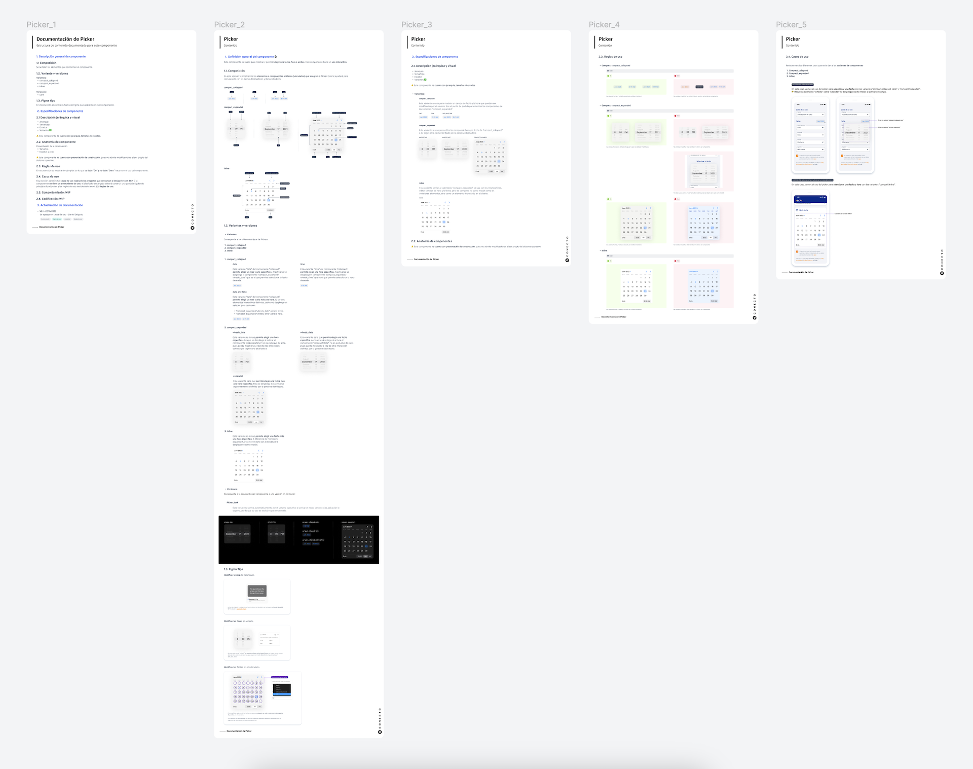
Sample of the iOS component documentation I made. This screen is for one component only.
Conclusions
This is a very small sample of everything I made at the bank since 2022. Although the variety of tasks is much greater on a day-to-day basis, this summary serves to give an idea of the value that my work brought to the organization.
Working in banking is different from doing work in other fields, however, more than a challenge, I considered it an opportunity to do high-impact work that can improve the lives of millions of people in our country.