PDA Dominican Republic
Mobile app aimed to replace physical forms during field surveys in the Dominican Republic.
Introduction
The Government of the Dominican Republic, with the help of the Banco Interamericano de Desarrollo, created the Programa de Desarrollo Agroforestal to improve the productive capacity of the country's coffee, cocoa, and avocado farmers.
In 2020 and 2021, the consortium OP & Consultores Asociados, MVI Social, and Fundación REDDOM carried out the external and independent verification of said project, for which a mobile application was created that would replace the physical forms that the verifiers would take to the rural plots.
I worked on both verifications as the sole UX/UI designer and editorial.
Kickoff and research
The project was carried out during the COVID-19 pandemic, so it was impossible to travel to the Dominican Republic to conduct interviews with potential verifiers (for this project the term “verifier” was used as a synonym for “user”), and also because the hiring of these workers had not yet been made. Despite this, surveys were conducted and prospects created for the type of people to be hired. With this information, I was able to start the project.

The photograph shows both the wide range of ages that the verifiers had, as well as the use of the application in conjunction with the “field notebook.” One of the objectives of the application was to reduce its weight, which can be seen in the image. Photography courtesy of OP & Consultores Asociados.
I used the Design Thinking process to complete my part of the project, which was divided into two stages:
2020 verification: This included the first version of the app that was released and the data that was collected while being used.
2021 verification: Modifications were made to the application based on the data obtained during the previous verification.
It is also necessary to mention that when I joined the work team, there was already an alpha version of the application on which I started my work.
Design
The main reason for the application was to replace the physical forms that verifiers would carry into the field. These forms, which I designed, were the cornerstone of the project.
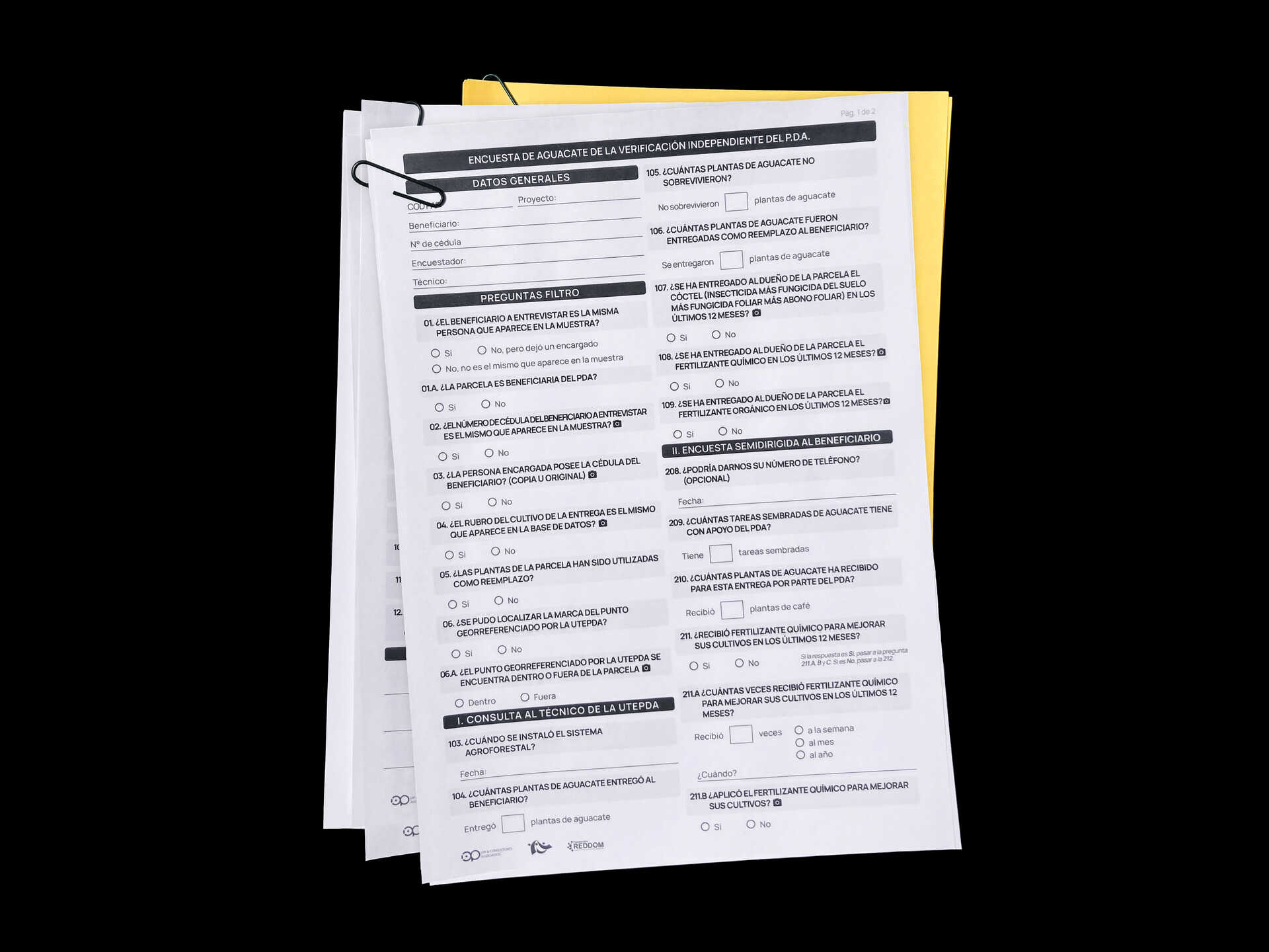
There were different versions of the forms depending on the crop, as well as other documents that the verifiers had to upload.
The forms were divided into several parts, the same ones that were used to divide the application into small parts that were easy to complete, thus avoiding cognitive overload on the verifiers.
This way I created the user-flow.
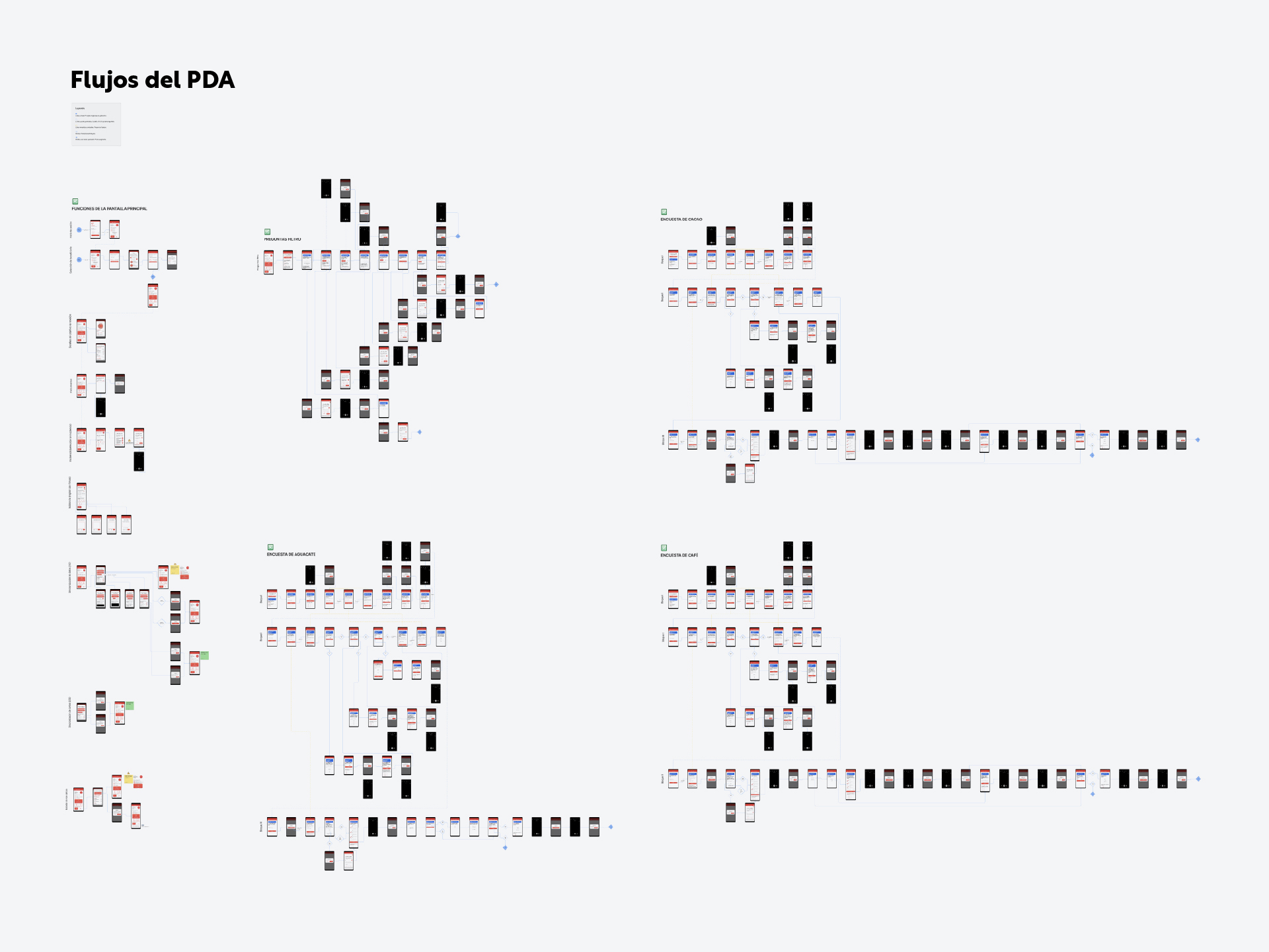
Although, given the length of the document, it is not possible to read the user-flow that I show, it can be noted that the middle and right part correspond to the entire logic of the surveys.
At the same time I created the user-journey. Although there was limited first-hand information, I considered essential to perform this step to understand under what circumstances the verifiers would use the product.

The interface ended up being 80% white, which favored visibility in bright places.
Results and next steps
The application would come pre-installed on an Android device, so the verifier would not need to download the application. Also, their name and a pre-chosen password would be used for log in.
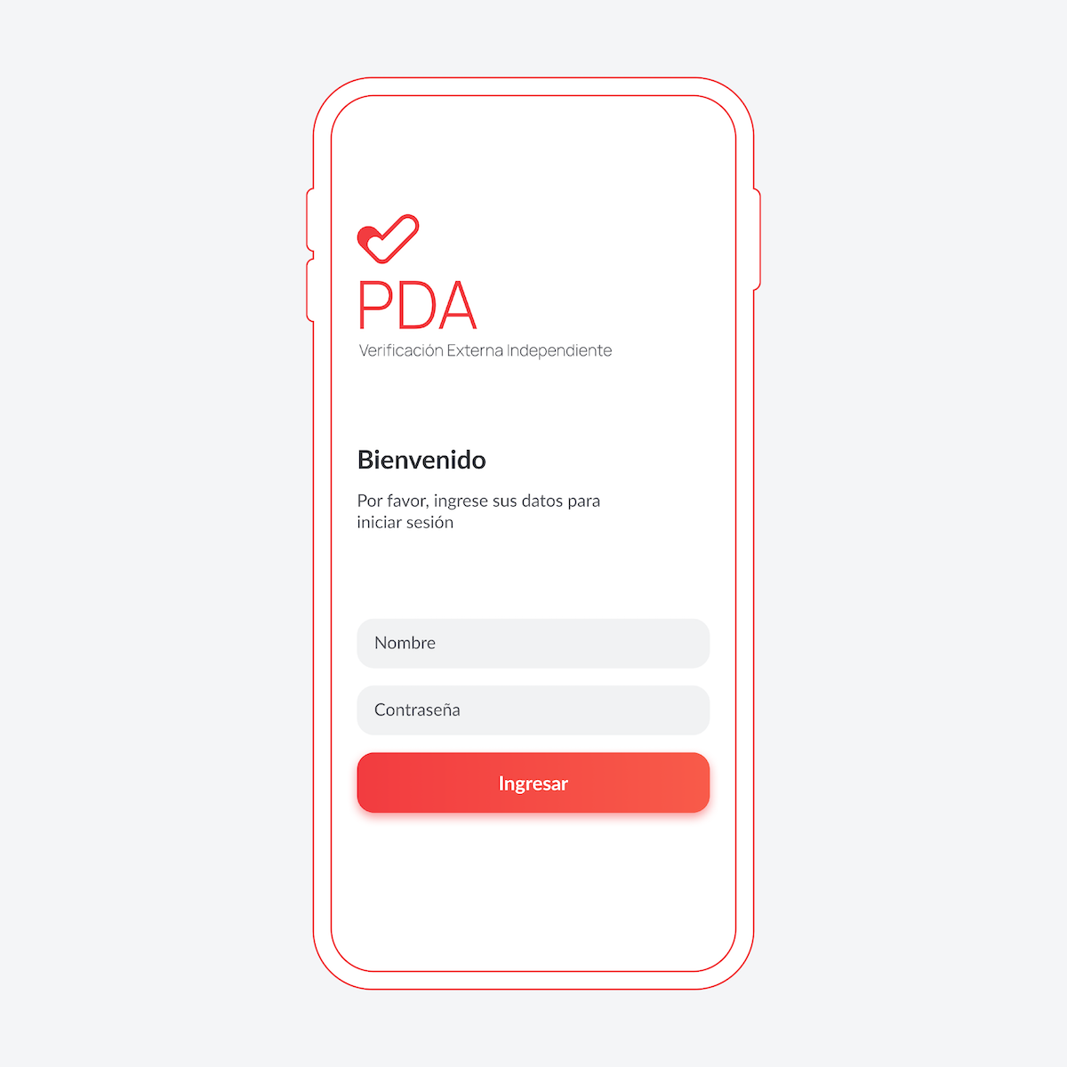
Login would take place during training work, not during the workday.
Following the UI considerations due to the cognitive overload of the verifiers and the survey structure, the main screen interface was divided into three, of which I only show the first two since the consulting firm only allows a partial sample of this project to be shown:
Selection of the beneficiary: This is where you choose who will be interviewed in the field.
Survey: Consists of the filter questions and questions to be asked.

The verifier could access all the functions of the application through this screen, without having to enter the menu.
The first step (selection of the beneficiary) had an advantage over the physical forms, since in the printed version the data must be manually written before conducting the interview. In the application it was only necessary to search for it in the database.
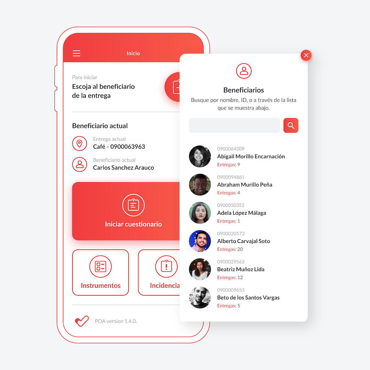
This step could be done even before contact with the beneficiary.
After selecting the beneficiary, the filter questions would begin. This step dictates the rest of the survey, since some answers invalidate future questions or the entire survey. This work is done automatically in the application following the logic detailed in the user-flow (review the second photo of this study). This was another big advantage over the physical forms.
After completing the filter questions, it would be possible to start with the survey questions.

The verifier could review the question that had to be filled out and read it to the beneficiary.
The survey could be filled out out of order, a method that the verifiers seemed to prefer during the 2020 verification. To facilitate this, navigation messages were placed indicating the questions that needed others to be considered correctly filled.

The logic of these questions were also in the physical forms. However, automatic logical jumps were possible only in the application.
Below the survey button there were the Instruments’ button and the Incidents’ button.
The first was a list of the objects that the verifiers had to carry each day.
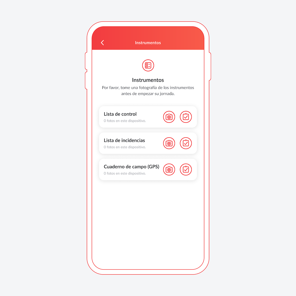
This section served as a checklist before starting a day of work.
The incidents (problems) screen was incorporated in the second verification (2021), increasing the functionality of the application, since the incidents were another physical form that had to be carried on.
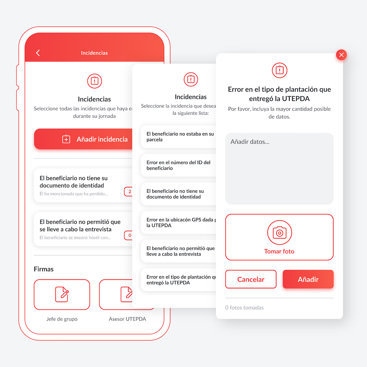
This section included several common issues to choose from, although it was also possible to add new ones.
This work cycle would be carried out every work day by the verifiers. For this reason, in-person training workshops were held, for which I designed the printed user manual of the application as well as the digital presentation.

In the photo you can see the demo version of the manual that I created with a Japanese binding. The final version was printed in the Dominican Republic.
Both verifications were considered a success, with the application helping to achieve this result by facilitating not only the work of the verifiers but also that of the consulting firm by reducing the time spent on data ingestion and error checking.